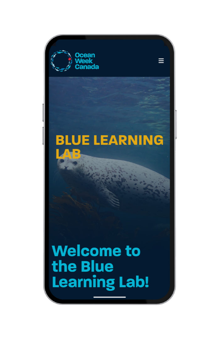
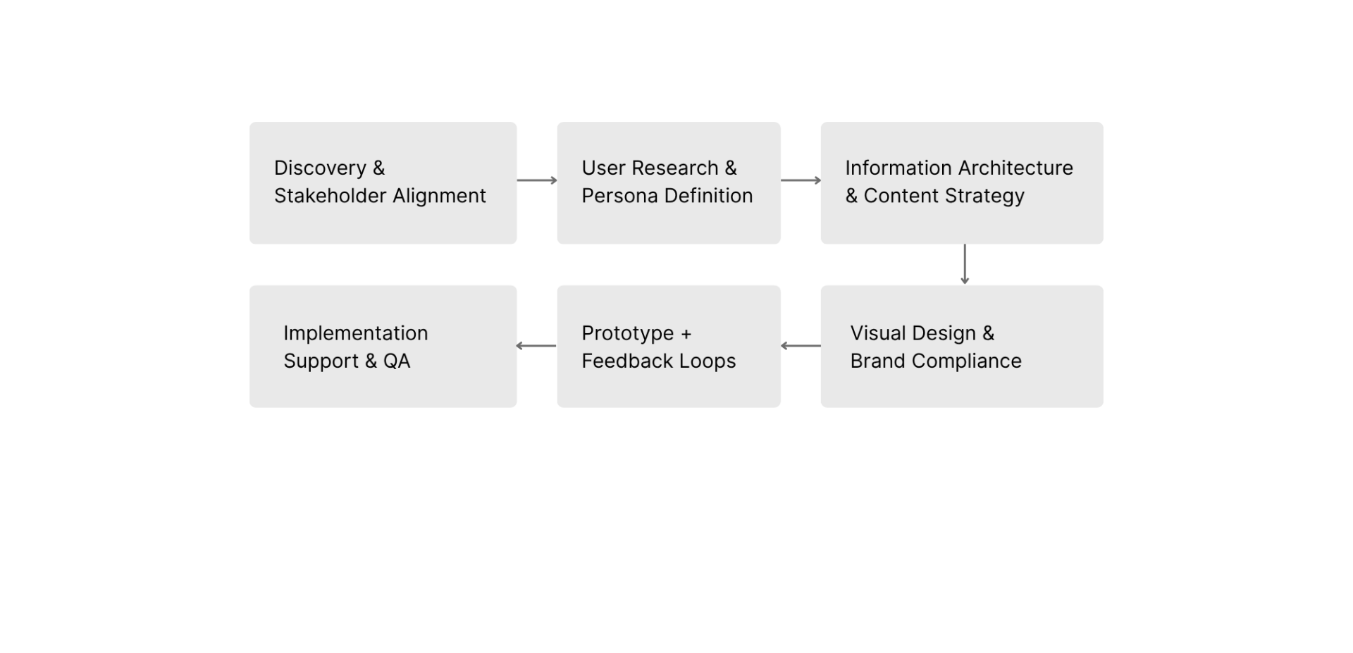
The Blue Learning Lab, once a cluttered hub for ocean literacy, was redesigned for clarity and navigation with a focus on audience-specific user flows, Information Architecture and cohesive branding.
The Blue Learning Lab, once a cluttered hub for ocean literacy, was redesigned for clarity and navigation with a focus on audience-specific user flows, Information Architecture and cohesive branding.
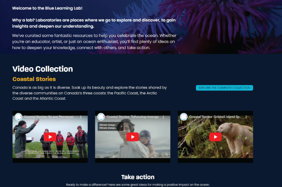
The Blue Learning Lab was a digital hub for ocean literacy serving multiple user groups but lacked clarity and structure. The redesign was also driven by the need to integrate Blue Schools Canadainto the platform whose resources were previously scattered, making it hard for educators to find and use them.
The average viewing time per page was low for the wealth of information available on the platform.
of surveyed educators said they couldn’t easily find relevant resources within their available time.
partner organizations reported dissatisfaction with their visibility.
of surveyed users said they felt unengaged and somewhat overwhelmed.
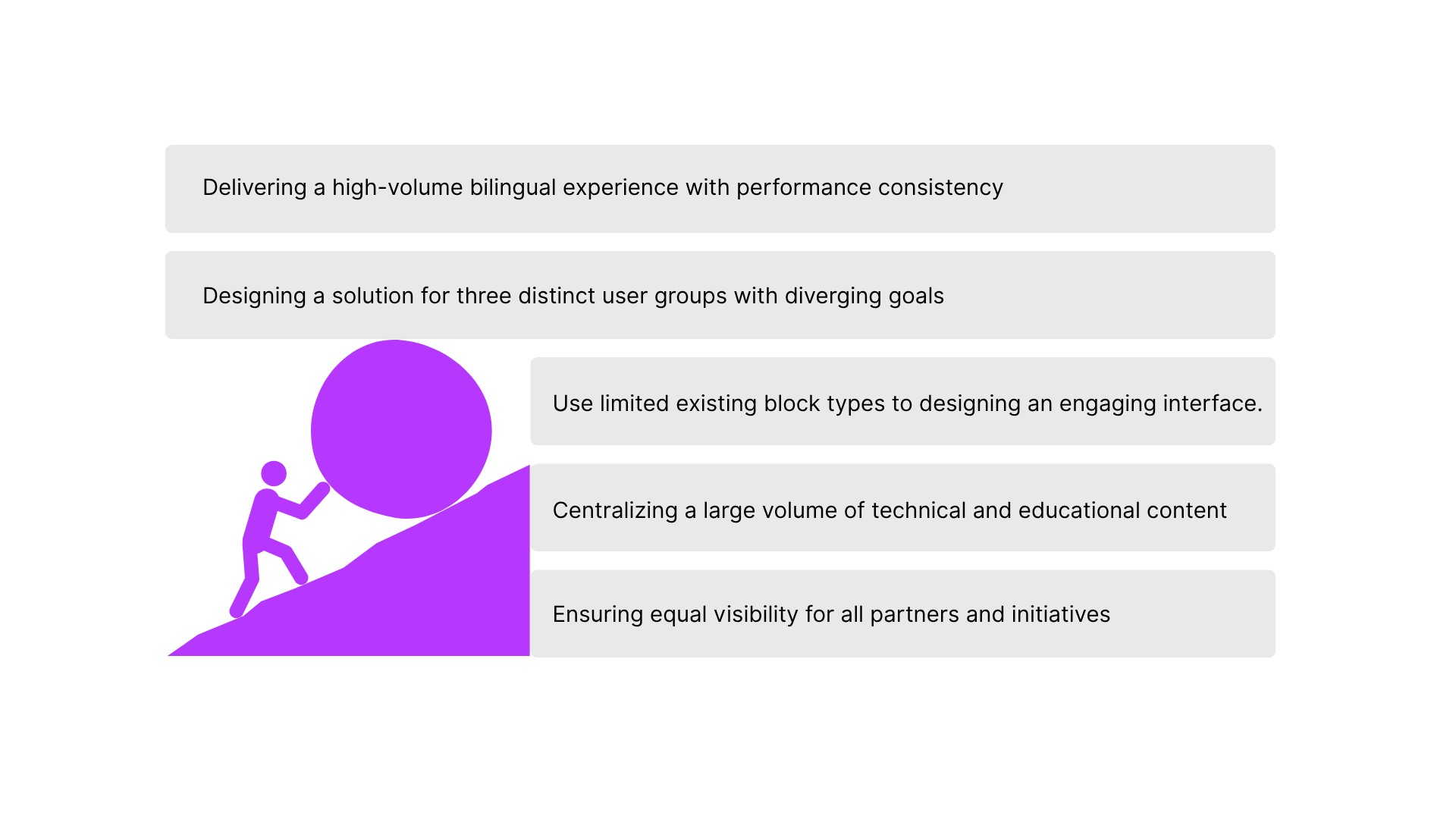
Research confirmed that users fell into three clear intent-based groups, each with unique needs:
A. General Public (exploratory learning)
B. Educators (curriculum-ready materials)
C. Changemakers (action-oriented resources)
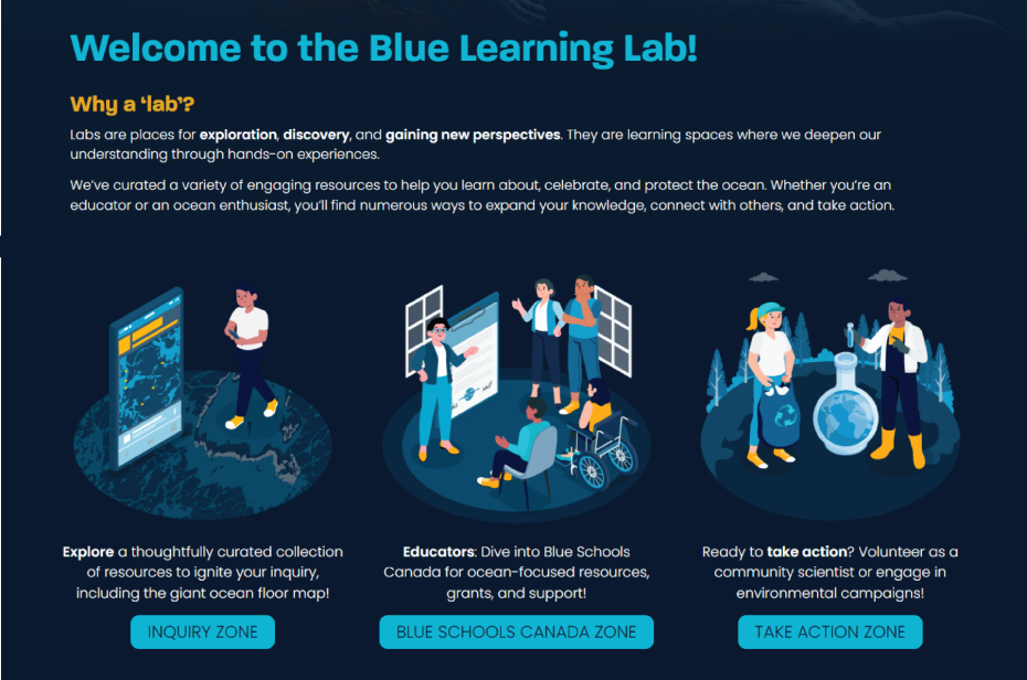
To resolve content confusion and streamline navigation, the site was divided into three clearly defined zones to cater to these 3 user groups. All content and UX flows were mapped to these zones, resulting in a platform that feels intentional and intuitive:
Designed for the general public (User group A) to explore and build general knowledge. Features beginner-friendly content, alternative ways of exploration, partner initiatives, Indigenous stories and additional resources.
Dedicated area for educators and school communities (Group B). Hosts curriculum-aligned resources, Blue Schools Canada registration info, community resources and case studies.

Built for individuals or communities looking to make a difference (Group C). Offers toolkits, campaigns, volunteering options, daily tips and advocacy resources.
Each user group enters through a zone tailored to their goals, ensuring quick access and reduced friction.
Users are now able to toggle between zones and sub-sections. Additionally, a few open loops were closed, additional materials and downloadable packs were included in the platform and outbound links were added to improve SEO.
Implemented cohesive visual design and branding tailored to distinct user groups, with a focus on diversity, inclusivity, and intuitive navigation. Accessibility was enhanced by following WCAG guidelines and through features like alt text and support for voice-enabled screen readers.